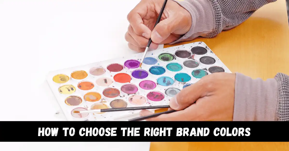
How to Choose the Right Brand Colors


Color psychology is the study of how colors can influence human behavior and decision-making. In branding, color psychology plays a crucial role in creating a visual identity that resonates with consumers and effectively communicates a brand’s values and messaging. The purpose of this article is to provide guidance on how to choose the right brand colors based on color psychology.
Color Psychology
Color psychology is the study of how colors can influence human behavior and decision-making. Colors can evoke different emotions and associations, and these associations can vary depending on cultural background and personal experiences. For example, red is often associated with passion and excitement, while blue is often associated with trust and stability.
In branding, color psychology plays a crucial role in creating a visual identity that resonates with consumers and effectively communicates a brand’s values and messaging. Studies have shown that color can influence consumer behavior and decision-making, with consumers being more likely to remember a brand and make a purchase if the brand’s colors align with their expectations and associations.
- Definition of color psychology: Color psychology is the study of how colors can influence human behavior and decision-making.
- Role of color in branding: Color psychology plays a crucial role in creating a visual identity that resonates with consumers and effectively communicates a brand’s values and messaging.
- Emotions and associations: Different colors can evoke different emotions and associations, and these associations can influence consumer behavior and decision-making.
- Cultural differences: Colors can have different meanings and associations in different cultures, and it is important to be aware of these differences when choosing brand colors.
Choosing the Right Brand Colors
When choosing brand colors, it is important to consider the brand’s personality and target audience. The brand’s colors should align with the brand’s values and messaging, and should also appeal to the target audience. For example, a brand that values sustainability and eco-friendliness might choose earthy greens and browns, while a brand that targets a younger demographic might choose bright and bold colors.
It is also important to consider cultural differences in color perception. Colors can have different meanings and associations in different cultures, and it is important to be aware of these differences when choosing brand colors. For example, in some cultures, white is associated with purity and innocence, while in others it is associated with mourning and death.
- Brand personality: The brand’s colors should align with the brand’s values and messaging.
- Target audience: The brand’s colors should appeal to the target audience.
- Cultural differences: It is important to be aware of cultural differences in color perception when choosing brand colors.
Color Combinations and Contrast
Color combinations and contrast play a crucial role in branding. Effective color combinations can help a brand stand out and create visual interest, while poor color combinations can make a brand appear dull and unappealing.
When creating color combinations, it is important to consider color harmony. Color harmony refers to the way that different colors work together to create a visually pleasing and balanced design. There are several different principles of color harmony, including complementary, analogous, and monochromatic.
Contrast is also an important factor to consider when choosing brand colors. Contrast refers to the difference in lightness and darkness between two colors, and can be used to create visual hierarchy and draw attention to important elements of a design.
- Color harmony: The way that different colors work together to create a visually pleasing and balanced design.
- Principles of color harmony: Complementary, analogous, and monochromatic.
- Contrast: The difference in lightness and darkness between two colors.
Testing and Refining Brand Colors
Testing and refining brand colors is an important step in the branding process. It is important to gather feedback on brand colors from a variety of sources, including focus groups, surveys, and A/B testing.
A/B testing is a method of comparing two versions of a design to see which one performs better. This can be a useful tool for refining brand colors, as it allows you to test different color combinations and see which one resonates most with your target audience.
- Gathering feedback: Focus groups, surveys, and A/B testing.
- A/B testing: A method of comparing two versions of a design to see which one performs better.
Conclusion
Choosing the right brand colors is an important part of creating a strong and cohesive brand identity. By considering factors such as color psychology, brand personality, target audience, cultural differences, color combinations, and contrast, it is possible to choose colors that effectively communicate a brand’s values and messaging and resonate with consumers. Regular testing and refining of brand colors is also crucial to ensure continued success and brand consistency.
FAQS
What is color psychology?
Color psychology is the study of how colors can influence human behavior and decision-making.
How do colors influence consumer behavior and decision-making?
Colors can evoke different emotions and associations, and these associations can influence consumer behavior and decision-making. For example, consumers are more likely to remember a brand and make a purchase if the brand’s colors align with their expectations and associations.
How do I choose the right brand colors?
When choosing brand colors, it is important to consider the brand’s personality and target audience, and to choose colors that align with the brand’s values and messaging. It is also important to consider cultural differences in color perception.
What is color harmony?
Color harmony refers to the way that different colors work together to create a visually pleasing and balanced design.
What is contrast?
Contrast refers to the difference in lightness and darkness between two colors, and can be used to create visual hierarchy and draw attention to important elements of a design.
What is A/B testing?
A/B testing is a method of comparing two versions of a design to see which one performs better. This can be a useful tool for refining brand colors, as it allows you to test different color combinations and see which one resonates most with your target audience.


Leave a Reply